Blog
The Art of Color Coordination: Matching Paint with Decor for Interiors and Exteriors
Have you ever felt the allure of transforming your living spaces with a fresh coat of paint? The prospect of matching paint colors for interiors that seamlessly blend with your furniture, curtains, rugs, and decor accessories can be exhilarating. It’s a journey that holds the promise of elevating the mood and style of your interiors and exteriors, breathing new life into your surroundings. But the question remains: How do you embark on this colorful adventure and find the perfect wall paint color match for interiors and exteriors that resonates with your vision? In this odyssey of aesthetics and creativity, we’ll unveil the secrets of harmonious and stunning color schemes for both your interiors and exteriors.
Embrace the Color Wheel:
Picture a canvas where colors dance in harmony, each with its unique role to play. This is the essence of the color wheel—a versatile tool that unveils the relationships between different colors for both interiors and exteriors. It illuminates how colors complement, contrast, or even clash with one another. With the color wheel as your guide, you can embark on a journey to discover color combinations that range from analogous (colors next to each other) to complementary (colors opposite each other), triadic (three evenly spaced colors), or tetradic (four colors forming a rectangle). These combinations are the keys to unlocking different effects in your space, whether it’s a calm oasis, a vibrant haven, a balanced retreat, or a dynamic showcase.
Focus on the Light:
As the sun and stars cast their rays upon your home, the hues on your walls come alive, dancing with the light for both interiors and exteriors. Natural light has the magical ability to make colors appear brighter and warmer, while artificial light often imparts a cooler and darker tone, keep these in mind while selecting matching paint colors for exteriors. The secret lies in understanding how paint colors interact with various lighting conditions. To master this, test your chosen paint colors at different times of the day—morning, afternoon, and evening—to witness the enchanting transformations for both interiors and exteriors. Additionally, keep an eye on the direction of your windows; north-facing rooms tend to bathe in cooler light, while their south-facing counterparts bask in warm radiance.
Choose Your Dominant Color:
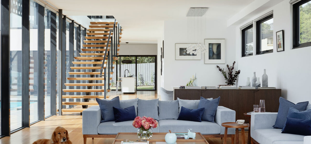
Every grand masterpiece has its protagonist, a character that sets the tone and defines the narrative. In the realm of interior design, this leading role belongs to the dominant color—a hue inspired by a cherished piece of furniture, an exquisite rug, a captivating painting, or any other cherished element within your space for both interiors and exteriors. The dominant color is more than a mere choice; it’s a reflection of your personality, your style, and the emotions you wish to evoke in your room. For instance, to craft a cozy and relaxing bedroom, a soft blue or green might be your dominant color for both interiors and exteriors, whereas a lively and energetic living room may find its essence in a bright yellow or orange.
The Symphony of Accent Colors:
Just as a captivating melody is enriched by harmonious notes, a well-designed space flourishes with accent colors. These secondary hues infuse intrigue and contrast into your room, much like the crescendos in a symphony. Use them to highlight architectural features, such as doors, windows, moldings, or fireplaces, or to create focal points through cushions, lamps, vases, artworks, and more for both interiors and exteriors. While accent colors should harmonize with your dominant color, they should also preserve their individuality and not overshadow the star of the show. You can turn to the color wheel for guidance or explore shades and tints of the same hue for a subtler effect.
Balancing Warmth and Coolness:
In the universe of colors, a fascinating dichotomy exists between warmth and coolness. Warm colors—those with red, orange, or yellow undertones—imbue spaces with coziness, inviting energy, and vibrance. In contrast, cool colors—bearing blue, green, or purple undertones—confer a sense of calm, soothing ambiance, and spaciousness. Achieving harmony in your interior and exterior paint color scheme calls for a delicate balance between the two for both interiors and exteriors. The rule of thumb is to use either 60% warm colors and 40% cool colors or vice versa, steering clear of visual discord.
Seek the Guidance of Professionals:
While the journey to match paint colors can be an exhilarating and creative endeavor, there may be moments when you seek the wisdom of a seasoned guide for both interiors and exteriors. That’s where GulfPaints, a professional paint company in the UAE, steps in as your trusted advisor. GulfPaints, distinguished among paint factories in the UAE, stands ready to be your partner on this colorful voyage. Offering a wide array of interior wall paints and exterior wall paints for residential and commercial projects, GulfPaints boasts a team of seasoned color consultants. These experts are poised to assist you in discovering the perfect wall paint color match for both your interiors and exteriors.
Matching paint colors with your decor unfolds as an enjoyable and fulfilling process when you heed these simple steps. In doing so, you unlock the potential to create a breathtaking color scheme that captures your unique personality, elevates your property’s beauty, and amplifies its value for both interiors and exteriors. Whether you’re envisioning a tranquil sanctuary, a vivacious haven, or anything in between, GulfPaints is your partner in the quest for color coordination perfection. Contact GulfPaints today and embark on your journey to create harmonious and captivating interiors and exteriors. Your canvas awaits, your dreams beckon—make them a vibrant reality with the perfect wall paint color match.
